- NEW
-
Bathroom Furniture
Bathroom Furniture TypesBathroom Furniture StylesBathroom Furniture Finishes
- Baths
-
Basins & WCs
Basin TypesBasin & WC Styles
-
Taps
TAP TYPESTAP STYLES
- Showers
-
Lighting
Smart Lighting Solutions
-
Mirrors
-
Cabinets
Cabinet TypesCabinet Styles
-
Accessories
Accessory Types
-
Guides & Ideas
InspirationBathroom StyleBathroom Type
Home Tour - Nic's Nest at No.34
A Bright & Beautiful Bathroom Renovation
Interiors lover and working mum Nicola Keane first had the opportunity to realise her creative ambitions when she and her husband Andrew moved from their three-bed flat to a pretty ‘fixer-upper’ four-bedroom house in the historic town of Paisley, just outside Glasgow. We took a look inside her enviable ensuite and talk to her about her stunning bathroom before & after.
Tell us a little about your bathroom renovation.
We bought our house in October 2015 and inherited two very old-fashioned bathrooms. Our ensuite was the worst of the two- a cream/beige suite with old fashioned tiles, a lowered wooden panelled ceiling, cheap laminate flooring and the bath was so old the front panel had a massive crack along it that had been sellotaped over. It was not exactly the bathroom of dreams!
Where did you get inspiration for the design?
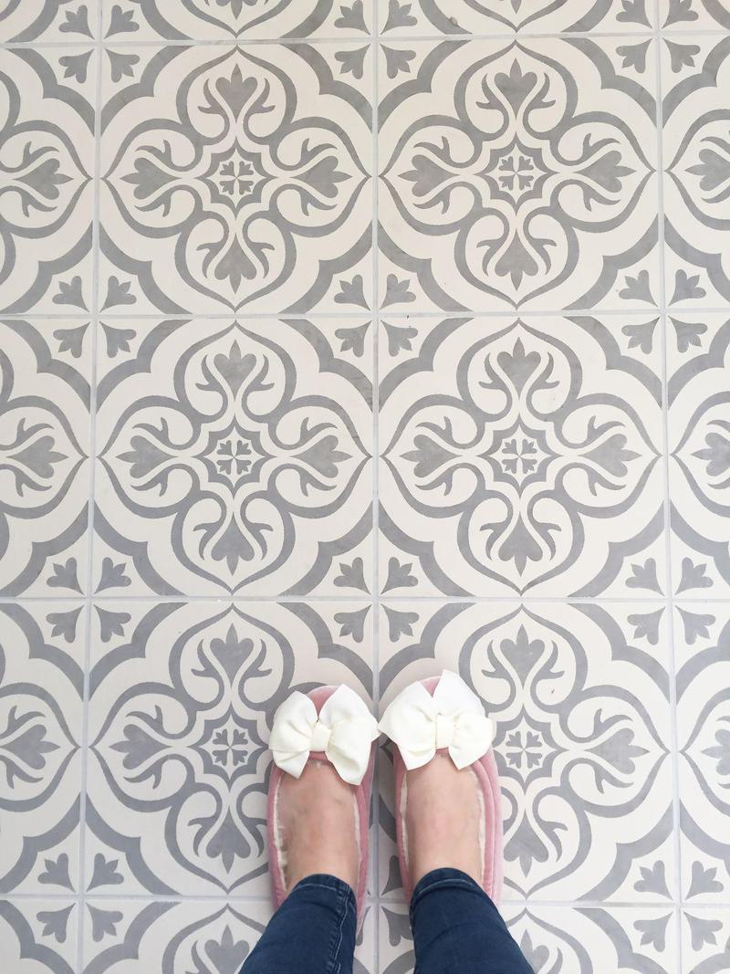
It was February 2017 before we finally got around to redecorating our ensuite. I had been pinning ideas on Pinterest, saving bathrooms on Instagram, scrolling bathroom websites and could not wait to go bathroom suite shopping!! I always knew I wanted subway tiles for our walls and patterned floor tiles – that was always the dream but I wasn’t too sure about the kind of suite I wanted.
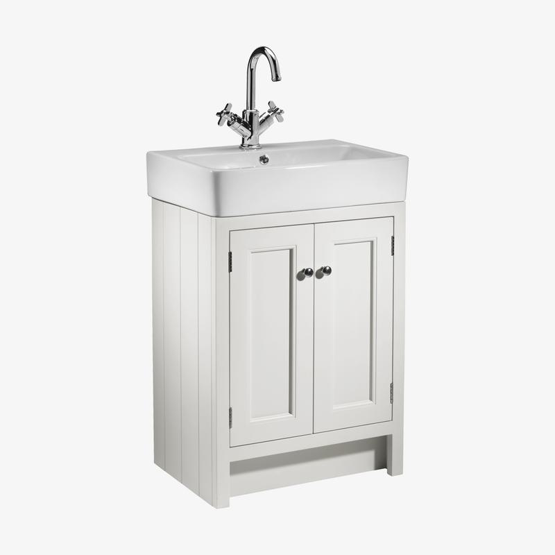
As soon as we started bathroom shopping I could tell straight away it was going to be more difficult that I first envisaged as the majority of bathroom suites were very modern with small, sharp vanity units that were just not what I was looking for. After we had been to a few bathroom showrooms I finally saw the Roper Rhodes Hampton vanity unit and fell in love! It comes in two sizes and as our ensuite is a decent size I insisted on the bigger 700mm vanity unit. I could just see both my boys brushing their teeth and sharing the massive sink!
Take us through the design process!
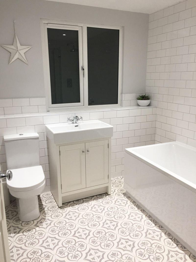
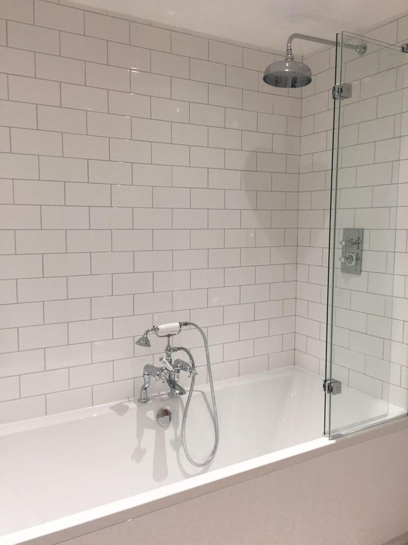
Everything really grew from the Hampton Basin unit. We chose our taps and shower head (Roper Rhodes Henley) in keeping with the style. I really wanted our bathroom to have a clean, classic, vintage look. I liked the look of both the chalk white and slate grey colours of the unit and so the showroom agreed to order in samples for me before deciding on colour.
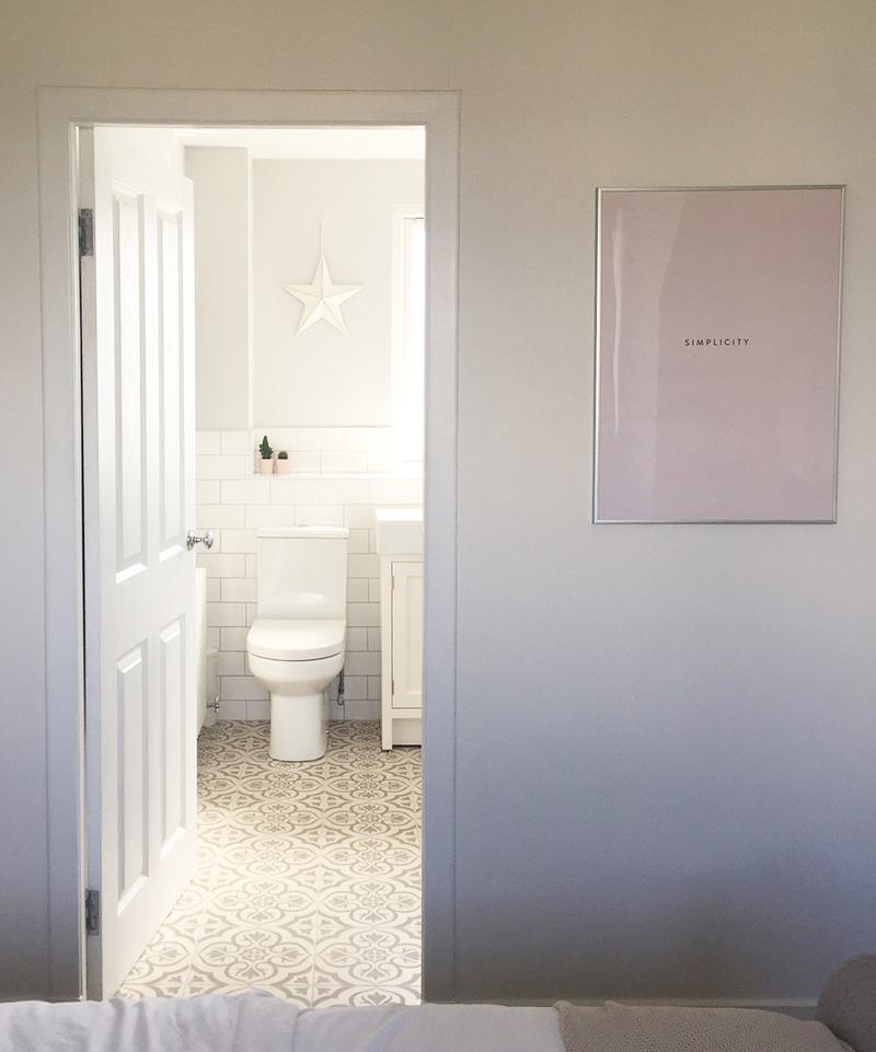
I decided to go for the Hampton Basin Unit in chalk white as I knew it would never date. I loved the slate colour too but the chalk-white colour helped blend the pure white subway tiles I had chosen for the walls with my cream and grey patterned floor tiles. The walls definitely needed a colour as a contrast as the white was too plain. I decided on Farrow and Ball Blackened for the walls which is a lovely subtle blue-grey that tones in perfectly with our floor tiles.
What other bathroom features did you incorporate?
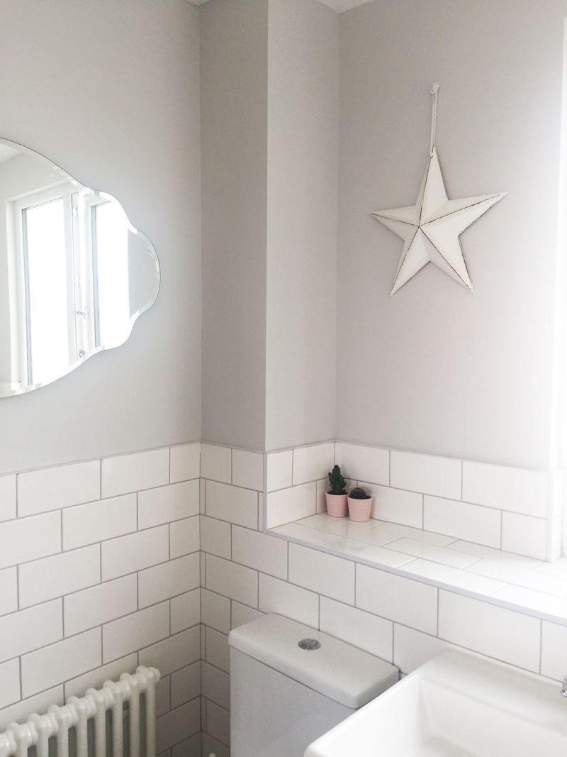
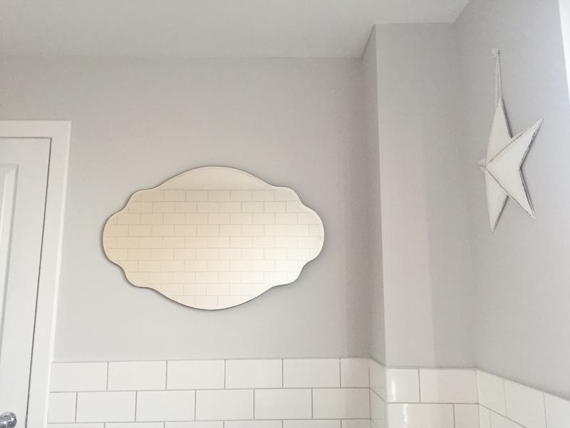
We settled on a larger sized bath, which was not my roll-top dream, but it was practical and would be more than luxurious after what we had been used to for the past year and a bit! I also chose an Acova Classic 2-column radiator from Screwfix to compliment our vintage look. Above the radiator, I wanted to make use of the space and I thought it was the ideal place to put a larger mirror. In keeping with my vintage theme, I chose the ‘Sophia’ mirror from Laura Ashley. It was a perfect fit.
Your bathroom is styled beautifully, what kind of finishing touches did you incorporate?
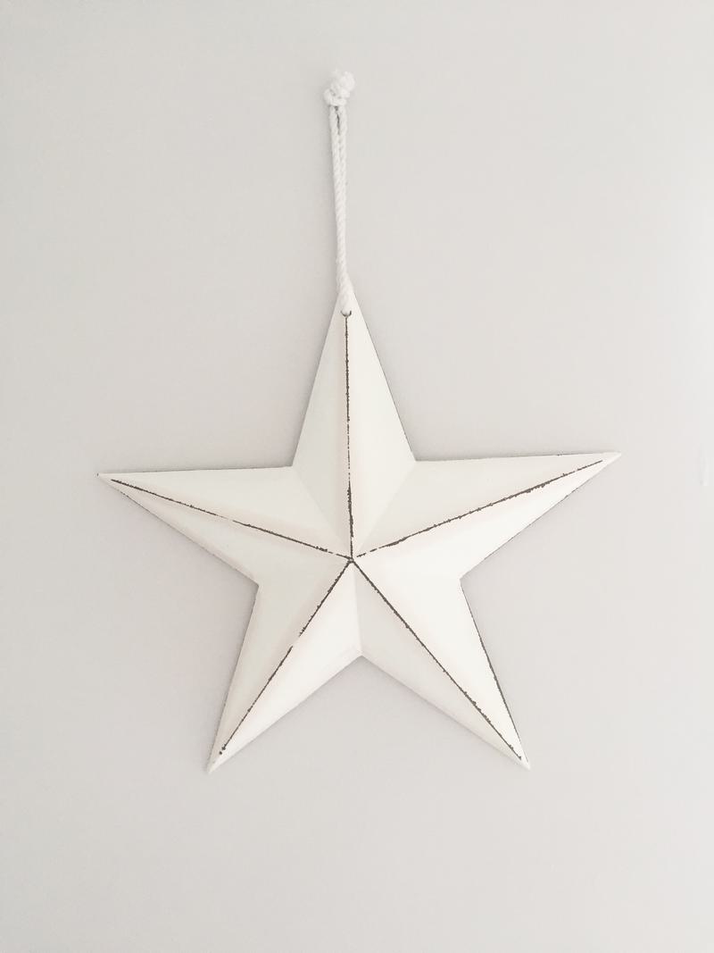
I wanted to add a few personal touches but keep the look of the ensuite clean and classic. I love stars and have them all over my house. When I saw a white shabby chic looking star in Debenhams I knew it would go perfectly and since then I have added some cactus, a candle and some black and white photographs of the boys in the bath since we have been in the house. Most of the time I have pale pink towels and bathmats to add some colour to our ensuite whilst keeping the overall look of the bathroom soft and elegant.
Overall, the transformation of our ensuite has been amazing. By raising the ceiling and lightening up the décor it looks like a completely different room and everyone comments on how much more spacious it is. Our Roper Rhodes vanity unit and tap/shower system has created a classic, vintage look that I longed for. I love waking up and looking into our ensuite, which used to be a cluttered, old-fashioned eyesore that we used as a dumping ground to hang up our washing, to see a light, airy, soft serene space.
Nicola’s Hints & Tips
Stick to your guns
If you love a look, go with it! We came up against quite a bit of resistance when we wanted subway tiles for the bathroom but I persevered!
Sample
Shop about and ask for swatches of different colours/materials. Most companies will send out samples for free in the post so you can really get an idea of the final result.
Get Inspired
Use Instagram and Pinterest for inspiration and ideas!
Invest
We chose Roper Rhodes as we knew it was good quality. We were told we could have saved money if we picked cheaper tap and shower head appliances with a similar look but this is an investment and if you get good quality materials and appliances then it’s worth paying the extra for. We had waited long enough to renovate our ensuite and we have no regrets.
To see Nicola’s lovely bathroom for yourself and follow her home renovation you can find her on Instagram at Nic’s Nest at 34
Why not share your bathroom ideas and inspirational interiors via @myroperrhodes on our Instagram page?
Discover our full range of bathroom products here.
